[Hot] Mobile SEO in 2017: Six Key Questions
In March, 2014, we posted our first full report on Mobile SEO, the "new" SEO strategy set to "upend conventional notions of traditional SEO." Our report was based on a Search Engine Journal infographic, "The 2014 Mobile Landscape: 25 Statistics That Will Drive The Future of Mobile Marketing," as well as Google's recent major algorithm update, Hummingbird, which was made, in part, to accommodate the voice-based searches common on mobile devices.
Since 2014, of course, mobile has dominated search news, and more digital marketing agencies have promoted the value of "Mobile SEO." In 2015, the SEO world was abuzz with talk of "Mobilegeddon," a dramatic shift in Google's algorithm that would destroy any site not optimized for mobile. As we reported earlier this year, Mobilegeddon was a non-event, at least according to Mark Munroe, who wrote an analysis of the numbers for Marketing Land:
"I have direct access to several sites that are extremely mobile unfriendly to the point of being mobile-nasty," Munroe wrote. "And yet … I can barely discern a difference."
However, Munroe did admit the chance of future changes: "I do expect more mobile updates — and perhaps they’ll have a far more significant impact."
Perhaps this is why some in the SEO world predicted a new Mobilegeddon in 2016, when Google announced that it would begin to increase the effectiveness of its mobile-friendly ranking factor.
Of course, Google was calm in its announcement:
"And remember, the intent of the search query is still a very strong signal — so even if a page with high quality content is not mobile-friendly, it could still rank well if it has great, relevant content."
Even then, the new Mobilegeddon was soon eclipsed by another big mobile development. In October, 2016, Google announced that its primary index, traditionally based on desktop websites, would now be based on mobile websites.
These changes, especially the recent "mobile-first" announcement, have inspired a flurry of questions from concerned website owners. We've compiled six of the most common--and pressing--questions below.
What is Mobile SEO?
Traditionally, SEO firms optimized websites based on a desktop layout. Obviously, websites look (and work) differently on mobile devices, so mobile SEO is the process of optimizing your mobile website for mobile devices.
Why Optimize for Mobile?
In a word, user experience. Without mobile optimization, a website will appear on mobile devices, but it may look and perform poorly.
When we first wrote about Google's mobile friendly ranking signal, before the signal significantly effected rankings, we performed a basic search for summer blazer. Among the results, we noted, the first two had the "mobile-friendly" designation and the third did not:
The third site, Lifestyle Mirror, which had not yet been optimized for mobile offered a poor mobile experience. In the screen grab below, you'll notice the tiny print and poor scrolling options: hallmarks of a website not optimized for mobile.
Of all the disadvantages of such a site, the prime problem was likely poor user experience. This is no longer an acceptable mobile experience; most users would simply navigate to another site. In early 2015, Google recognized this problem and acted accordingly, preferring sites with mobile-friendly designs.
In 2016, this type of mobile experience is exceedingly rare, but some websites--especially local websites--continue to display desktop designs for mobile devices.
Is Your Website Mobile-Friendly?
The simplest way to tell if your website is optimized for mobile is to Google your site from a mobile device. Does it look like the Lifestyle Mirror site above? If so, you are not optimized for mobile.
Google also offers a Mobile-Friendly Test.
What is the Mobile-First Index?
Traditionally, Google looked to desktop sites to determine search results. Now when crawling the web Google will look to mobile websites to answer queries.
Google has said the new mobile-index will not significantly effect rankings. However, this could change. And, of course, as we noted above, mobile-friendly is not simply about rankings--it's about user experience.
My Website is not Optimized for Mobile: Will it be Included in the Index?
Even websites that have not been optimized for mobile will be crawled: “If you only have a desktop site," Google writes, "we’ll continue to index your desktop site just fine, even if we’re using a mobile user agent to view your site.”
What if My Mobile and Desktop Sites Are Different?
Of course, websites appear different on each device, so the nature of the information may differ slightly. For example, mobile sites often offer less content. This could be a potential problem for a website if the desktop site offers more possibilities for a customer to make a conversion.
The solution is a "responsive design," which simply formats a website's content for any device.
Need Mobile SEO Help? Call Stepman's SEO!
We believe that ecommerce is now a mobile game! To navigate the new rules of mobile SEO, you might need to hire an SEO specialist like Stepmans PC. If you sell a high-quality product that deserves customers, you also deserve a well-optimized mobile website.
Do not let the changing search landscape compromise your sales. Now, more than ever, you need the astute wisdom of a professional search engine optimization professional.
Stepmans PC is now offering a free mobile website audit. Contact Stepmans PC today to learn how you can improve your website's mobile performance: 215-900-9398.
Since 2014, of course, mobile has dominated search news, and more digital marketing agencies have promoted the value of "Mobile SEO." In 2015, the SEO world was abuzz with talk of "Mobilegeddon," a dramatic shift in Google's algorithm that would destroy any site not optimized for mobile. As we reported earlier this year, Mobilegeddon was a non-event, at least according to Mark Munroe, who wrote an analysis of the numbers for Marketing Land:
"I have direct access to several sites that are extremely mobile unfriendly to the point of being mobile-nasty," Munroe wrote. "And yet … I can barely discern a difference."
However, Munroe did admit the chance of future changes: "I do expect more mobile updates — and perhaps they’ll have a far more significant impact."
Perhaps this is why some in the SEO world predicted a new Mobilegeddon in 2016, when Google announced that it would begin to increase the effectiveness of its mobile-friendly ranking factor.
Of course, Google was calm in its announcement:
"And remember, the intent of the search query is still a very strong signal — so even if a page with high quality content is not mobile-friendly, it could still rank well if it has great, relevant content."
Even then, the new Mobilegeddon was soon eclipsed by another big mobile development. In October, 2016, Google announced that its primary index, traditionally based on desktop websites, would now be based on mobile websites.
These changes, especially the recent "mobile-first" announcement, have inspired a flurry of questions from concerned website owners. We've compiled six of the most common--and pressing--questions below.
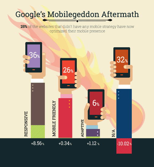 |
| Mobilegeddon did not significantly change rankings, but it did force many websites to optimize for mobile devices. This infographic from Smash Magazine shows the uptick in optimized sites. |
What is Mobile SEO?
Traditionally, SEO firms optimized websites based on a desktop layout. Obviously, websites look (and work) differently on mobile devices, so mobile SEO is the process of optimizing your mobile website for mobile devices.
Why Optimize for Mobile?
In a word, user experience. Without mobile optimization, a website will appear on mobile devices, but it may look and perform poorly.
When we first wrote about Google's mobile friendly ranking signal, before the signal significantly effected rankings, we performed a basic search for summer blazer. Among the results, we noted, the first two had the "mobile-friendly" designation and the third did not:
 |
| The first two sites here, Brooks Brothers and Pinterest, received the Mobile-Friendly tag (noted below the address before the description). The third result, Lifestyle Mirror, had not received the tag. |
The third site, Lifestyle Mirror, which had not yet been optimized for mobile offered a poor mobile experience. In the screen grab below, you'll notice the tiny print and poor scrolling options: hallmarks of a website not optimized for mobile.
.PNG) |
| Lifestyle Mirror's not-so-mobile-friendly page for "Summer Blazer." |
Of all the disadvantages of such a site, the prime problem was likely poor user experience. This is no longer an acceptable mobile experience; most users would simply navigate to another site. In early 2015, Google recognized this problem and acted accordingly, preferring sites with mobile-friendly designs.
In 2016, this type of mobile experience is exceedingly rare, but some websites--especially local websites--continue to display desktop designs for mobile devices.
Is Your Website Mobile-Friendly?
The simplest way to tell if your website is optimized for mobile is to Google your site from a mobile device. Does it look like the Lifestyle Mirror site above? If so, you are not optimized for mobile.
Google also offers a Mobile-Friendly Test.
What is the Mobile-First Index?
Traditionally, Google looked to desktop sites to determine search results. Now when crawling the web Google will look to mobile websites to answer queries.
Google has said the new mobile-index will not significantly effect rankings. However, this could change. And, of course, as we noted above, mobile-friendly is not simply about rankings--it's about user experience.
My Website is not Optimized for Mobile: Will it be Included in the Index?
Even websites that have not been optimized for mobile will be crawled: “If you only have a desktop site," Google writes, "we’ll continue to index your desktop site just fine, even if we’re using a mobile user agent to view your site.”
What if My Mobile and Desktop Sites Are Different?
Of course, websites appear different on each device, so the nature of the information may differ slightly. For example, mobile sites often offer less content. This could be a potential problem for a website if the desktop site offers more possibilities for a customer to make a conversion.
The solution is a "responsive design," which simply formats a website's content for any device.
Need Mobile SEO Help? Call Stepman's SEO!
We believe that ecommerce is now a mobile game! To navigate the new rules of mobile SEO, you might need to hire an SEO specialist like Stepmans PC. If you sell a high-quality product that deserves customers, you also deserve a well-optimized mobile website.
Do not let the changing search landscape compromise your sales. Now, more than ever, you need the astute wisdom of a professional search engine optimization professional.
Stepmans PC is now offering a free mobile website audit. Contact Stepmans PC today to learn how you can improve your website's mobile performance: 215-900-9398.